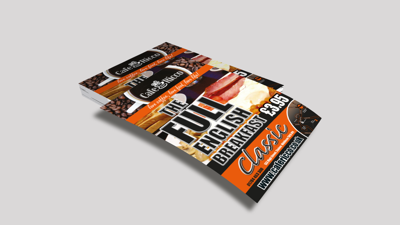
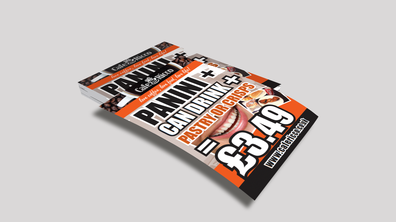
Case Study: Café Ricco - Maximising Footfall and Corporate Appeal
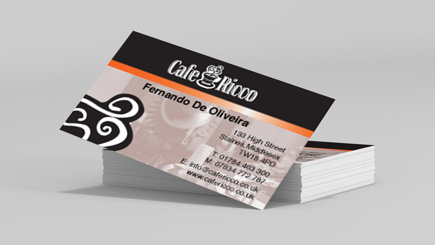
Café Ricco, located just off the main shopping area of Staines high street in Middlesex, competes with popular high street chains such as Costa Coffee, Baker's Oven, Gregg's, and McDonald's. However, with its proximity to the Centrica Head Office, it has a distinct advantage as office workers often stop by for a break or lunch.
A5 Flyer
A5 Flyer

A5 Flyer
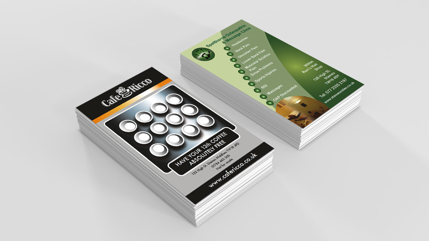
Double sided loyalty card
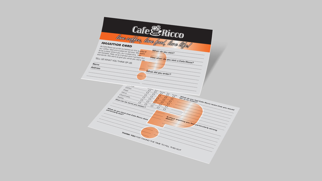
Customer feedback questionnaire
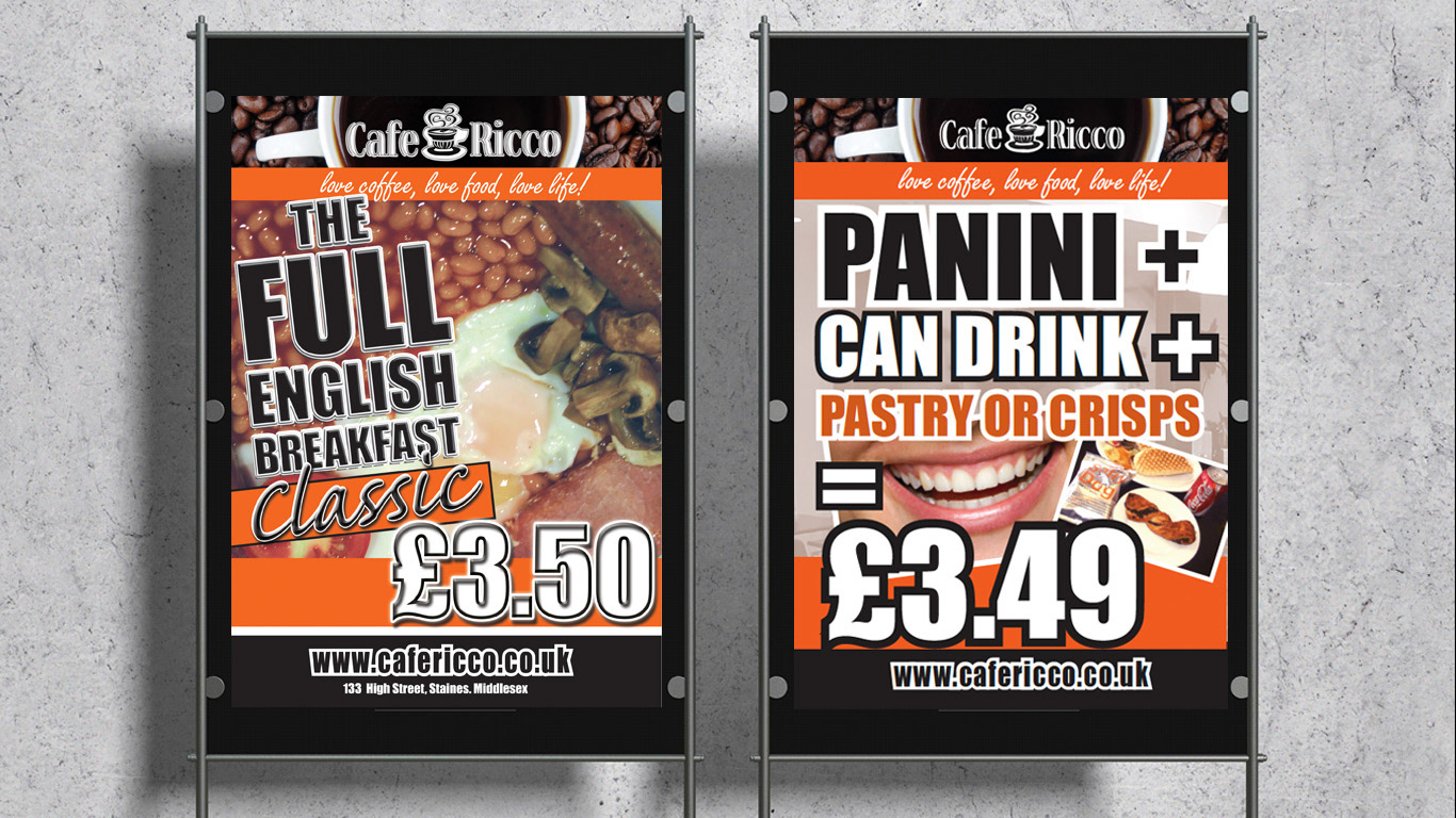
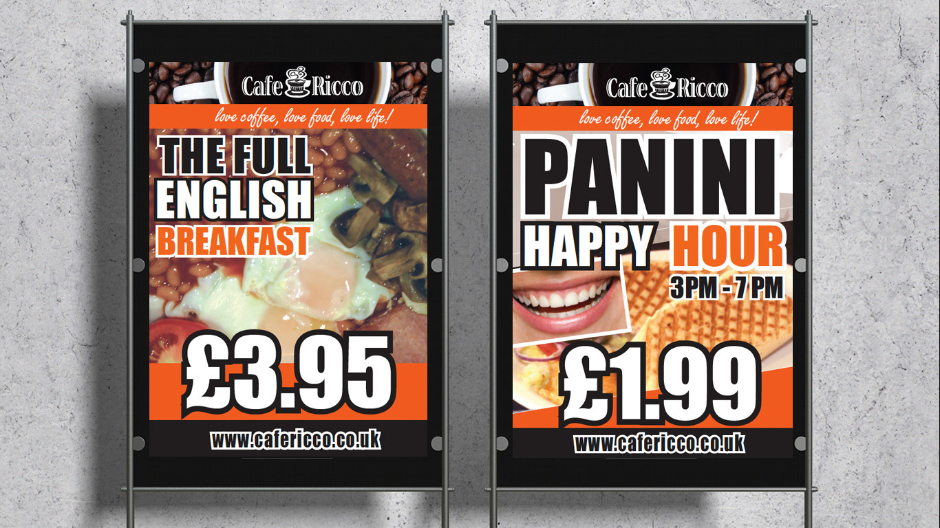
To drive sales from the busy high street and maintain a corporate image, Cafe Ricco needed a well-defined strategy. We introduced the strapline, "Love, Coffee, Love Food, Love Life," which captured the essence of the café's offerings. We incorporated this slogan into flyer designs distributed in the high street, attracting passersby and encouraging them to visit Cafe Ricco.
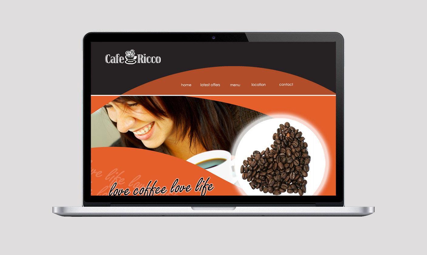
Additionally, we designed a website that offered a comprehensive menu and promoted special offers and new products. The Flash intro web page presented Cafe Ricco as a sophisticated, high-end café that appeals to more refined tastes, an appropriate strategy to target corporate customers. The point of sale posters communicated clear messages that aligned with the business's objectives while competing with larger high street brands.
By creating a consistent look and feel across all designs, we maximised footfall and maintained a corporate appeal for Cafe Ricco. Our work included branding, copywriting, art direction, photography, artworking, graphic design, website design, and script writing.
In summary, our strategy and execution helped Cafe Ricco stand out in a crowded market, drive sales from the busy high street, and maintain a corporate image that appeals to office workers and new customers alike.
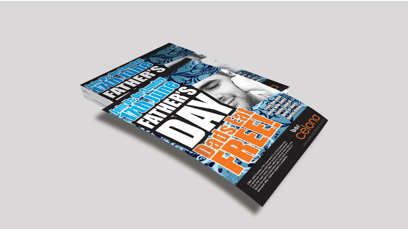
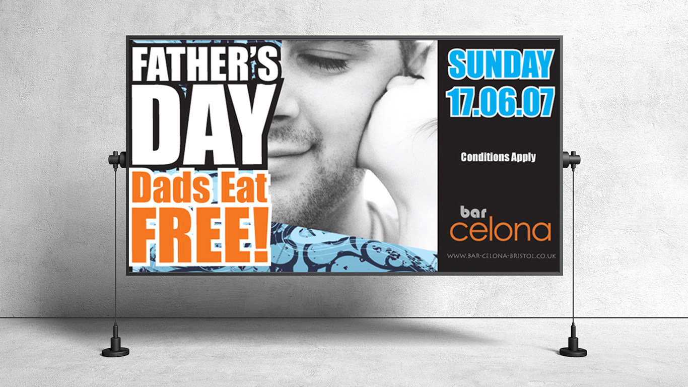
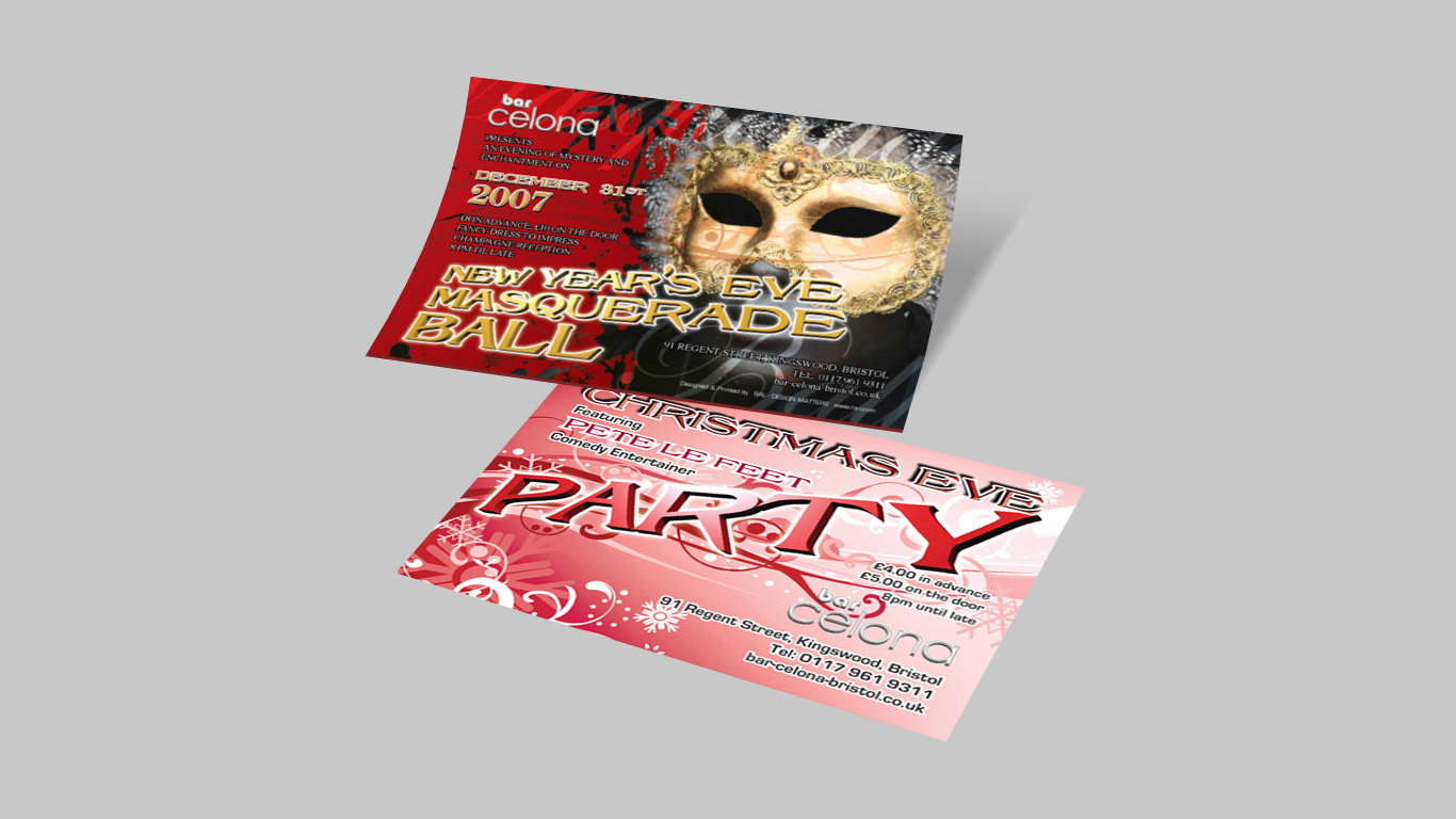
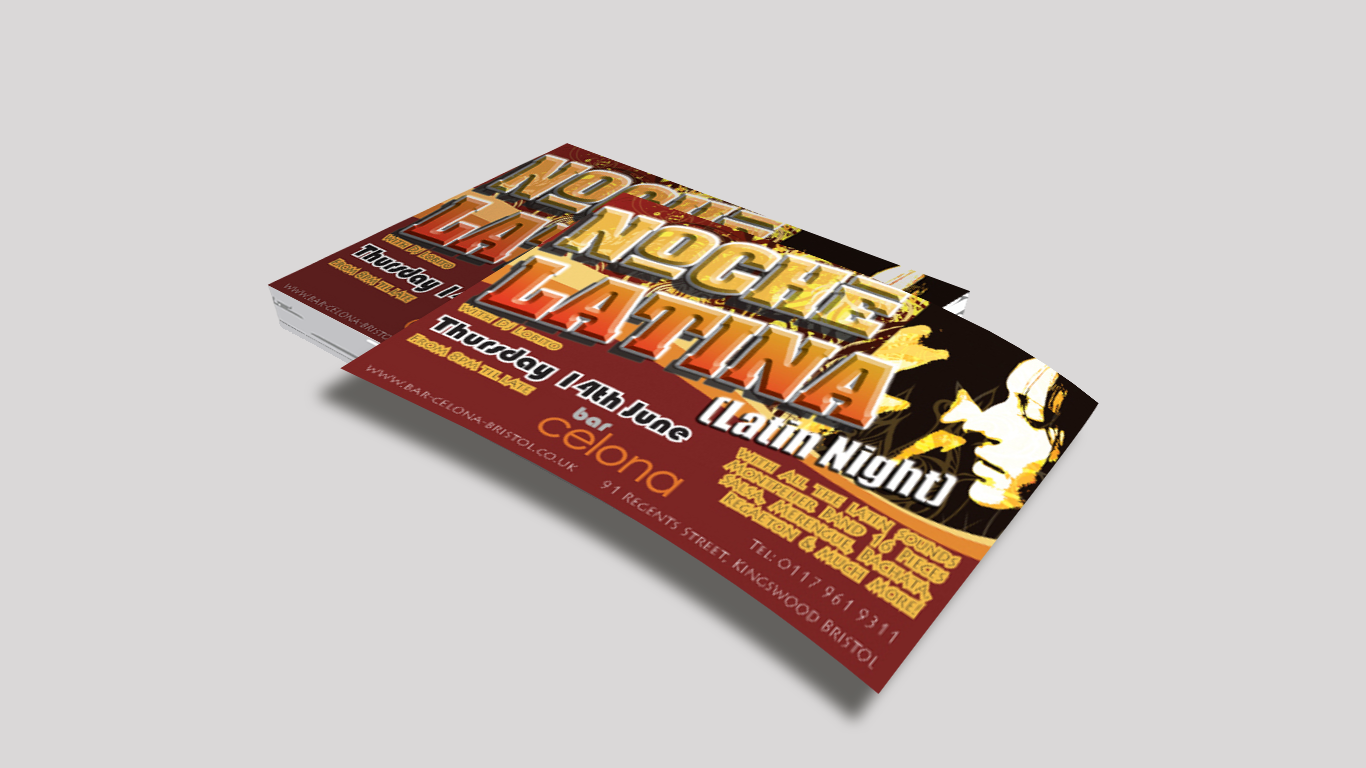
Case Study: "Party Time" - A Teen-Focused Event at BarCelona
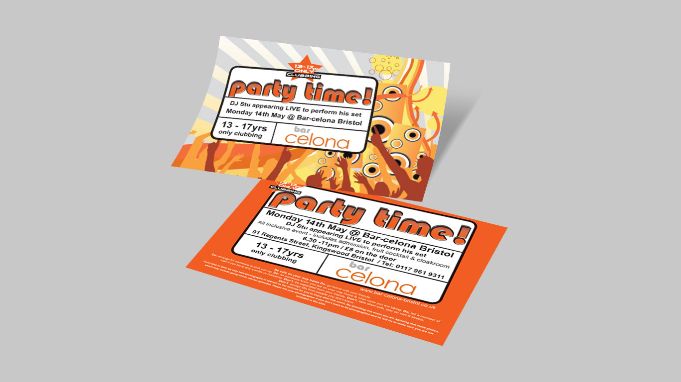
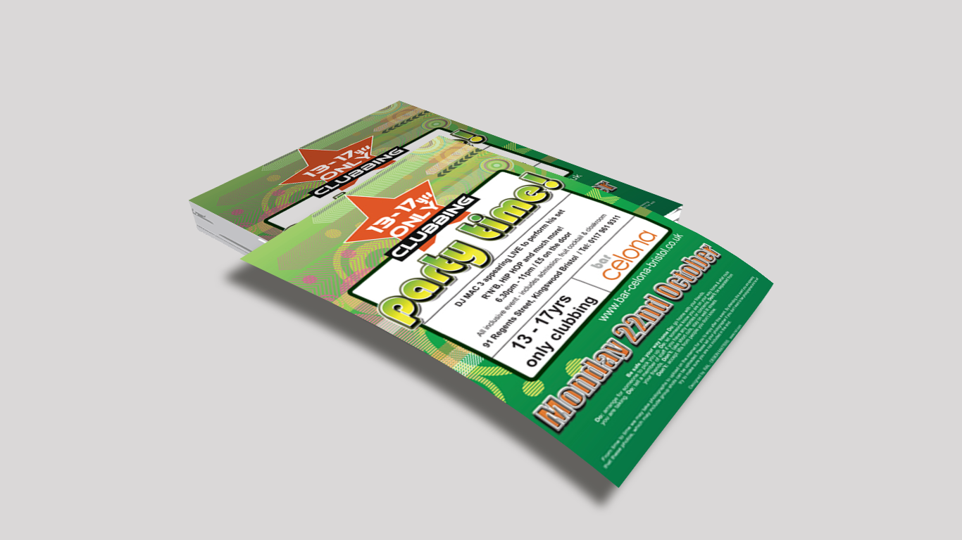
BarCelona, a restaurant and bar located in Kingswood, Bristol, introduced new nights of entertainment to promote less busy evenings. The goal was to attract teens aged 13 to 17 years for a supervised party night serving only soft drinks.
To effectively market this event, we designed flyers with the strapline "Party Time," which captured the essence of the event and made it more attractive to the target audience. We used bright and bold graphics and colors to make the flyers eye-catching and appealing to teens.
Our work included copywriting, strapline design, graphic design, and artworking. By creating a visually appealing and informative flyer, we were able to effectively communicate the event's purpose and attract the intended audience.
As a result, BarCelona is now recognised as a place of socialising for teens entering into adolescence and adulthood. Our marketing efforts helped establish a positive brand image for BarCelona among this demographic, attracting new customers and increasing revenue.
In summary, our work on the "Party Time" event helped BarCelona promote less busy evenings while appealing to a younger audience. Our focus on graphic design and copywriting maximised the impact of the marketing campaign and ultimately led to increased revenue for the business.
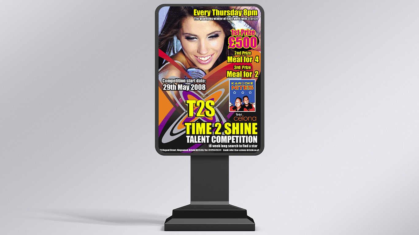
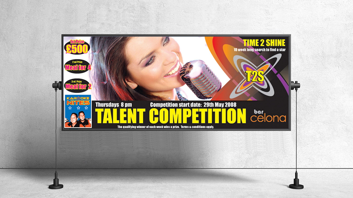
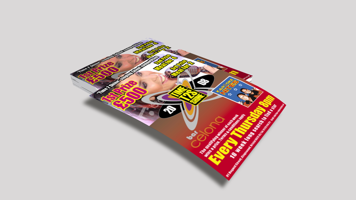
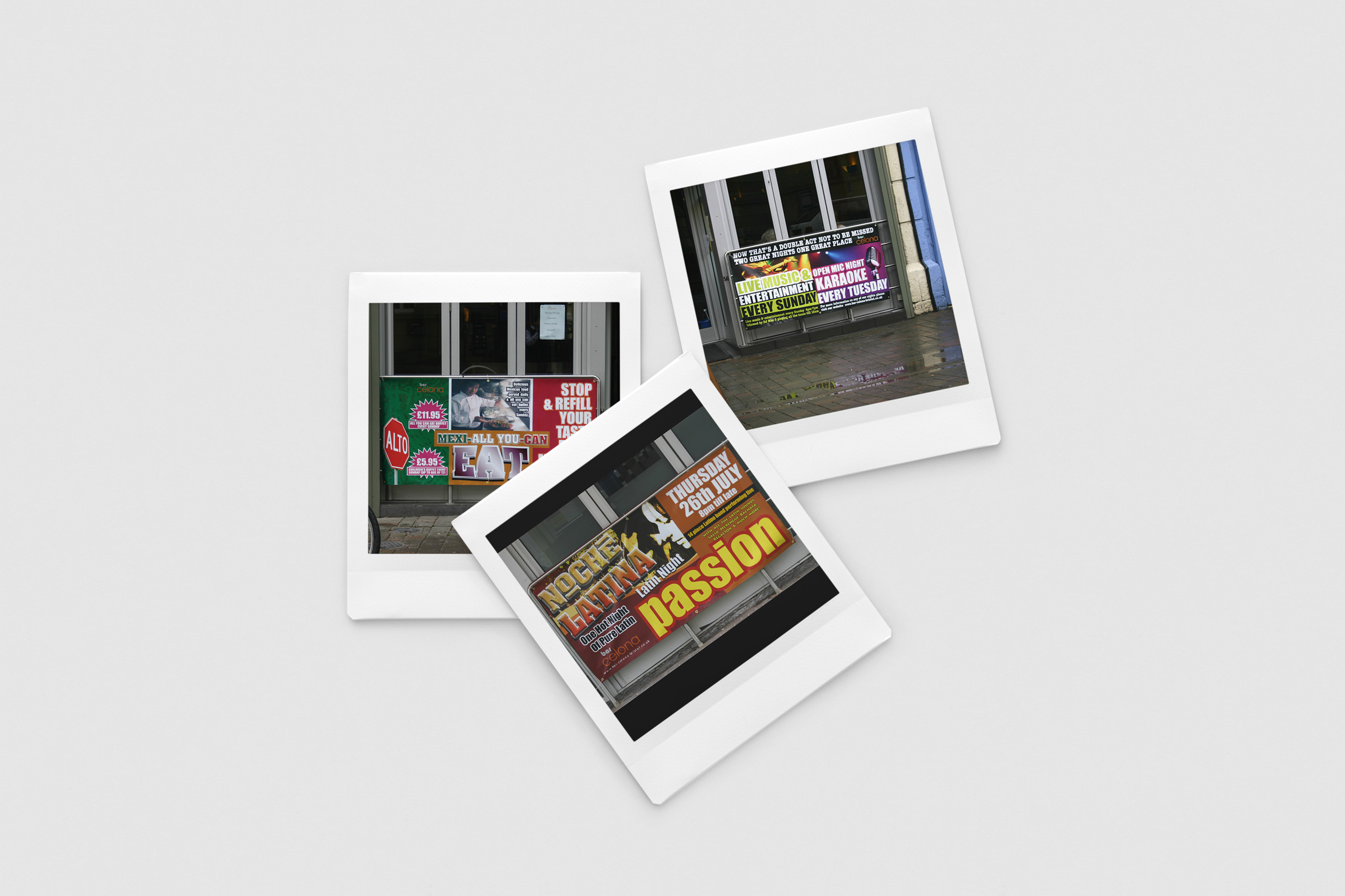
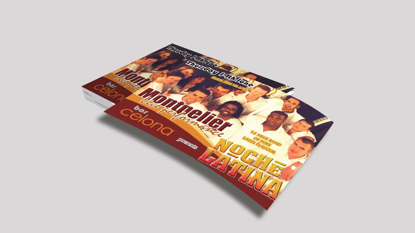
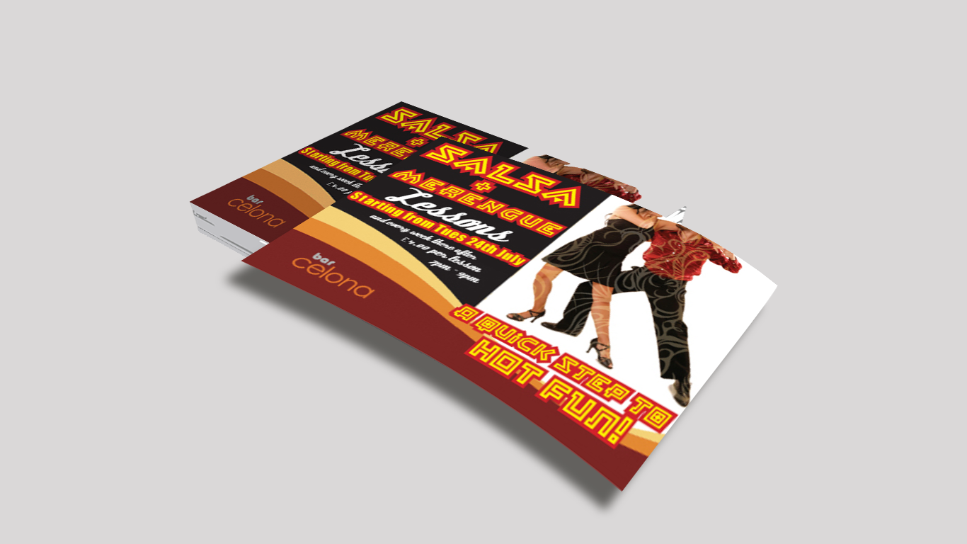
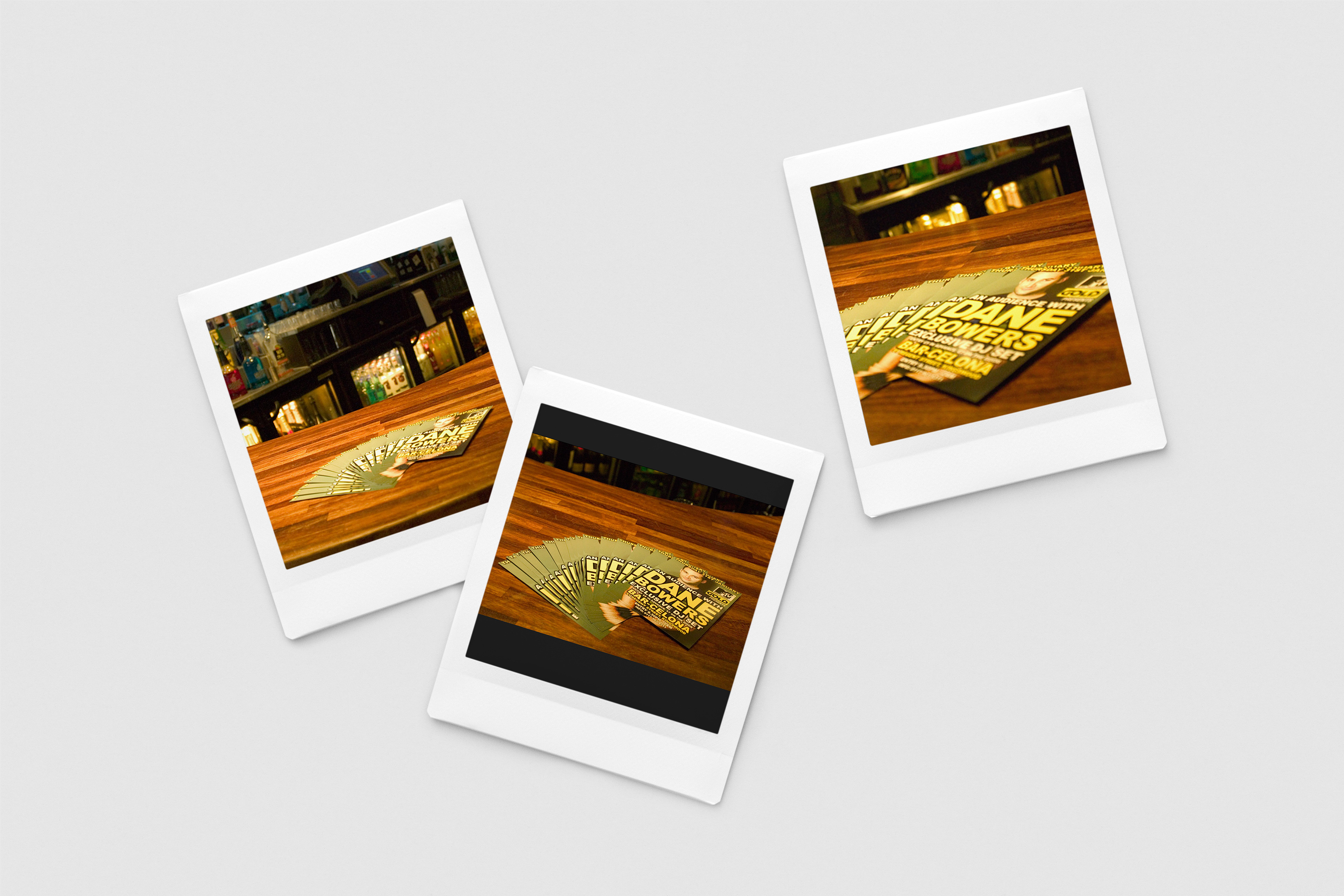
Case Study 2: "Time 2 Shine" - A Karaoke Competition at BarCelona
BarCelona, a popular bar and restaurant, wanted to capitalise on the popularity of the X-Factor television series by promoting a new karaoke competition. The competition was designed to attract fans of the series to participate in a singing competition, organised by the owners, and staged at the bar.
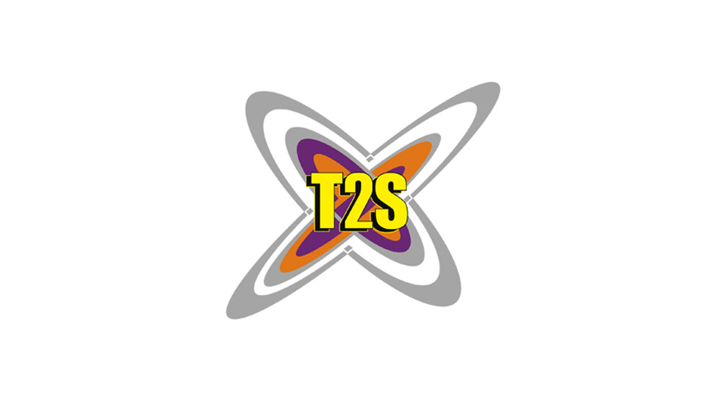
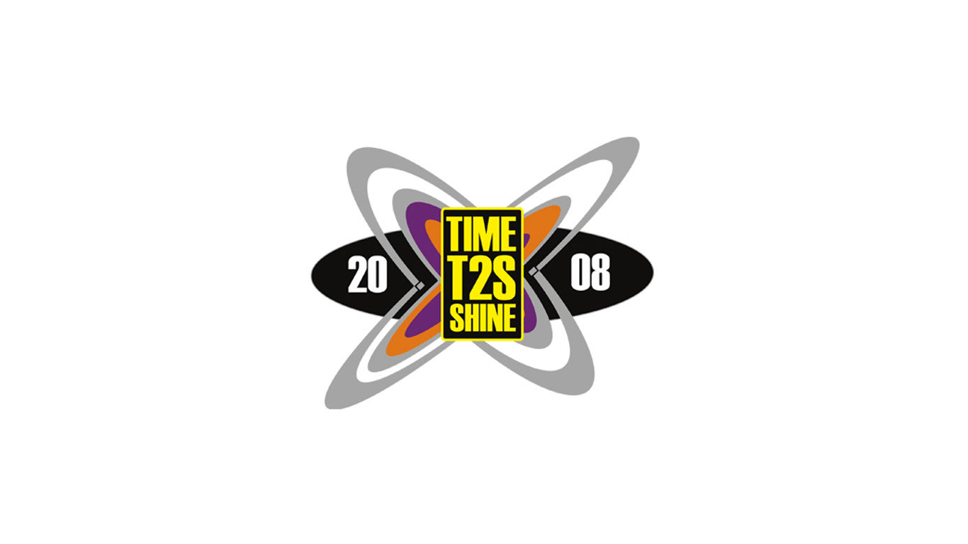
Our team worked on creating a new brand identity that would appeal to all ages, especially the X-Factor's typical audience. We designed a logo inspired by the "X-Factor" identity and created the slogan "Time 2 Shine," which was shortened to "T2S" for younger crowds. Our focus on branding and copywriting was essential in creating an identity that was both recognisable and appealing to the target audience.
We also designed flyers, posters, and banners to promote the competition, making use of eye-catching graphics and images that appealed to fans of the X-Factor. Our team's work included branding, strategy, brainstorming, art direction, photography selection, artworking, and graphic design.
The result was a successful competition that attracted a large number of participants and drew crowds to the bar. The competition's success prompted BarCelona to discuss future ideas for similar events and continue to build its brand identity.
In summary, our work on the "Time 2 Shine" karaoke competition helped BarCelona capitalise on the popularity of the X-Factor television series and attract a new audience. Our focus on branding and copywriting maximised the impact of the marketing campaign, ultimately leading to increased revenue for the business.
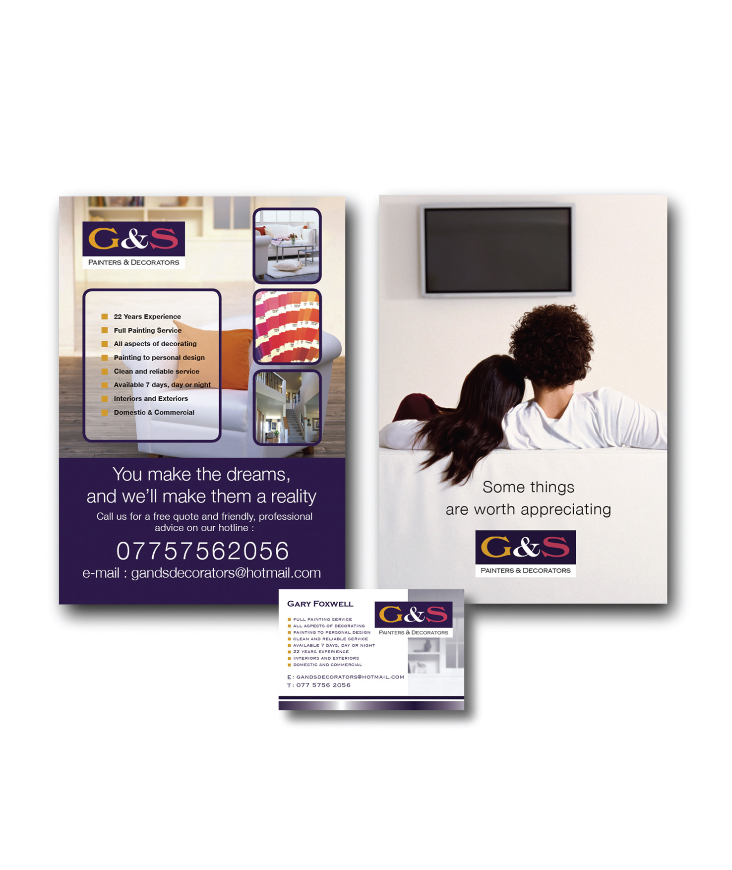
G&S Case Study: Marketing a Painting and Decorating Business with a Stylish Flyer
G&S is a small painting and decorating business that wanted to attract upmarket suburban homeowners in Surrey with their services. To achieve this goal, they came up with a stylish flyer that showcased their beautiful work samples and conveyed their unique selling proposition.
The flyer used copywriting that conveys depth and sophistication, making G&S stand out as "dream makers" in the industry. By tapping into every homeowner's urge to improve their abode, the flyer presented the idea that one can be an interior designer without having to do the hard work of DIY.
To support the "dream maker" concept, G&S developed a branding strategy that included a new logo, art direction, and photography selection that complemented their high-end positioning. The copywriting was crafted to support the concept, with a tagline that reads, "You make the dreams, we'll make them a reality."
The project also included brainstorming and artworking, with a focus on developing innovative ideas that would make the flyer stand out from the competition. The final product was a stylish flyer that not only looked great but also resonated with the target audience.
To support the flyer, G&S also developed business cards that reflected their high-end positioning and reinforced the "dream maker" concept. The graphic design of both the flyer and business cards were carefully crafted to reflect the brand's personality and values.
By using a combination of art direction, copywriting, and graphic design, G&S successfully marketed their painting and decorating business to upmarket suburban homes in Surrey. If you're looking to market your business with a stylish flyer, consider using G&S's case study as inspiration for your project.

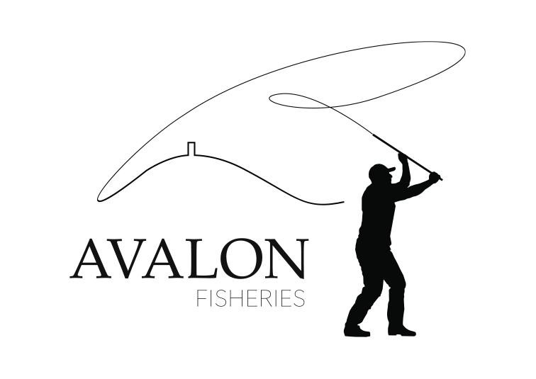
Revamping Avalon Fisheries' Website: A Case Study
Avalon Fisheries is a fishery in Somerset owned by Vic Bush. The fishery is located near the Glastonbury Tor, a 5th century fort and national treasure. The Tor is an important piece of local history and overlooks the fishery.
To revamp their existing website and give their business a fresh new look, Avalon Fisheries hired a team to help them with branding, photo selection, and graphic design.
The solution was to create a logo that incorporated the Glastonbury Tor and a figure of a fisherman casting a line. The logo perfectly captures the essence of Avalon Fisheries and their location.
The branding exercise was a success and helped Avalon Fisheries stand out from the competition. The photo selection and graphic design of the website also played an important role in the success of the project.
.
Branding Lusitania Driving School: A Case Study
Armando, a self-employed driving instructor, approached us seeking to promote his business to students and people who would otherwise choose larger and more established brands like BSM or AA. Our brief was to brand his business in a way that rivalled these larger brands while incorporating his Portuguese identity into the design.
Our solution was to create a logo that incorporated elements of the Portuguese flag, as well as the familiar symbol of a driving wheel. This helped give Lusitania Driving School a unique identity that was both professional and personal.
In addition to the logo, we designed a flyer that showcased Armando's expertise and experience as a driving instructor, along with the benefits of choosing Lusitania Driving School over other competitors. We also incorporated the logo and Portuguese design elements into the flyer to further enhance the branding.
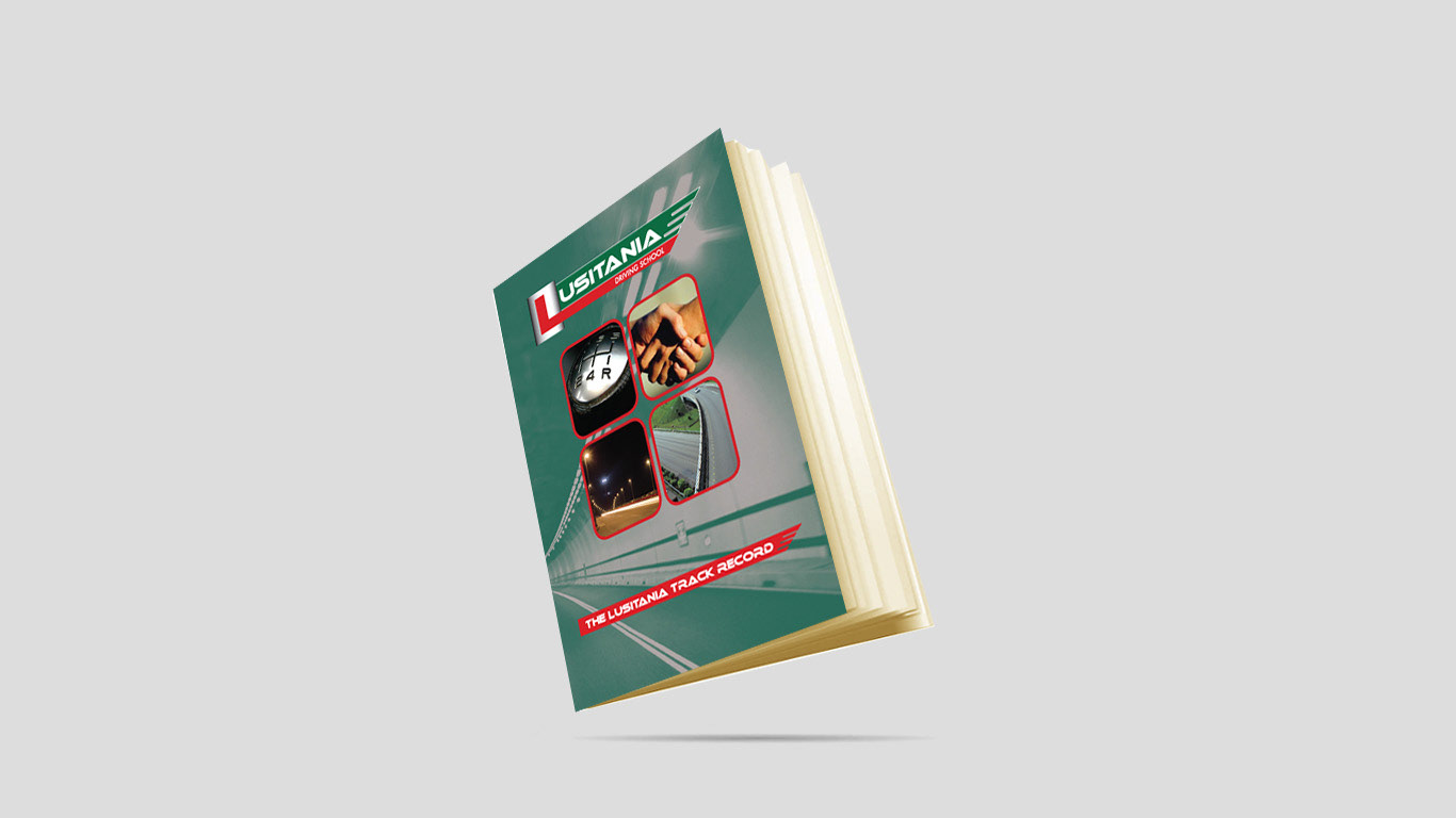
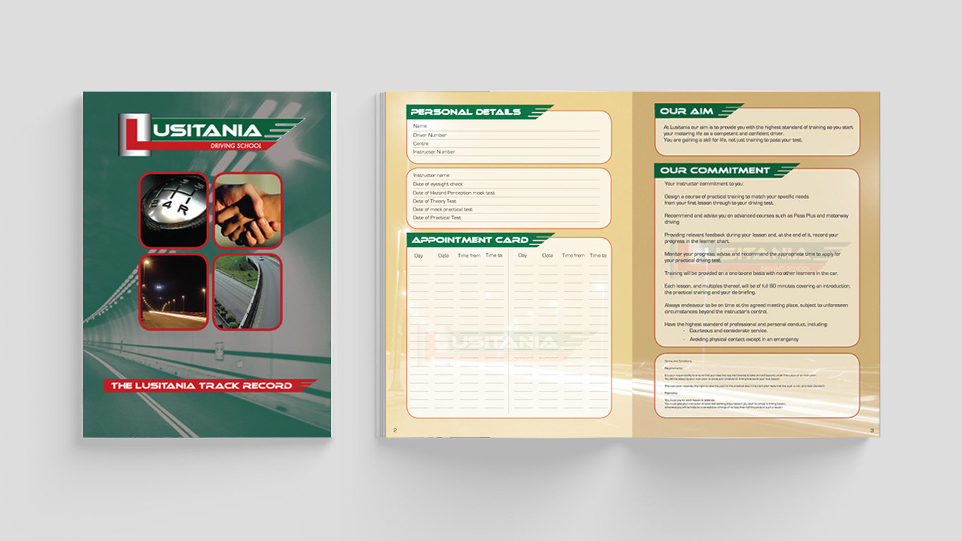
Finally, we designed an eight-page 'record of progress' booklet for Armando's students. This booklet not only helped students track their progress and achievements but also included two promotional vouchers integrated into the pages to lure more students to sign up for lessons.
Overall, the work we did for Lusitania Driving School included logo design, flyer design, and an eight-page booklet. By branding his business in a way that rivalled larger and more established brands, while incorporating his Portuguese identity, Armando was able to attract more students and grow his business. With the help of carefully selected photos, artworking, and graphic design, Lusitania Driving School is now well-positioned to continue expanding its reach and building a strong reputation in the driving instruction industry.
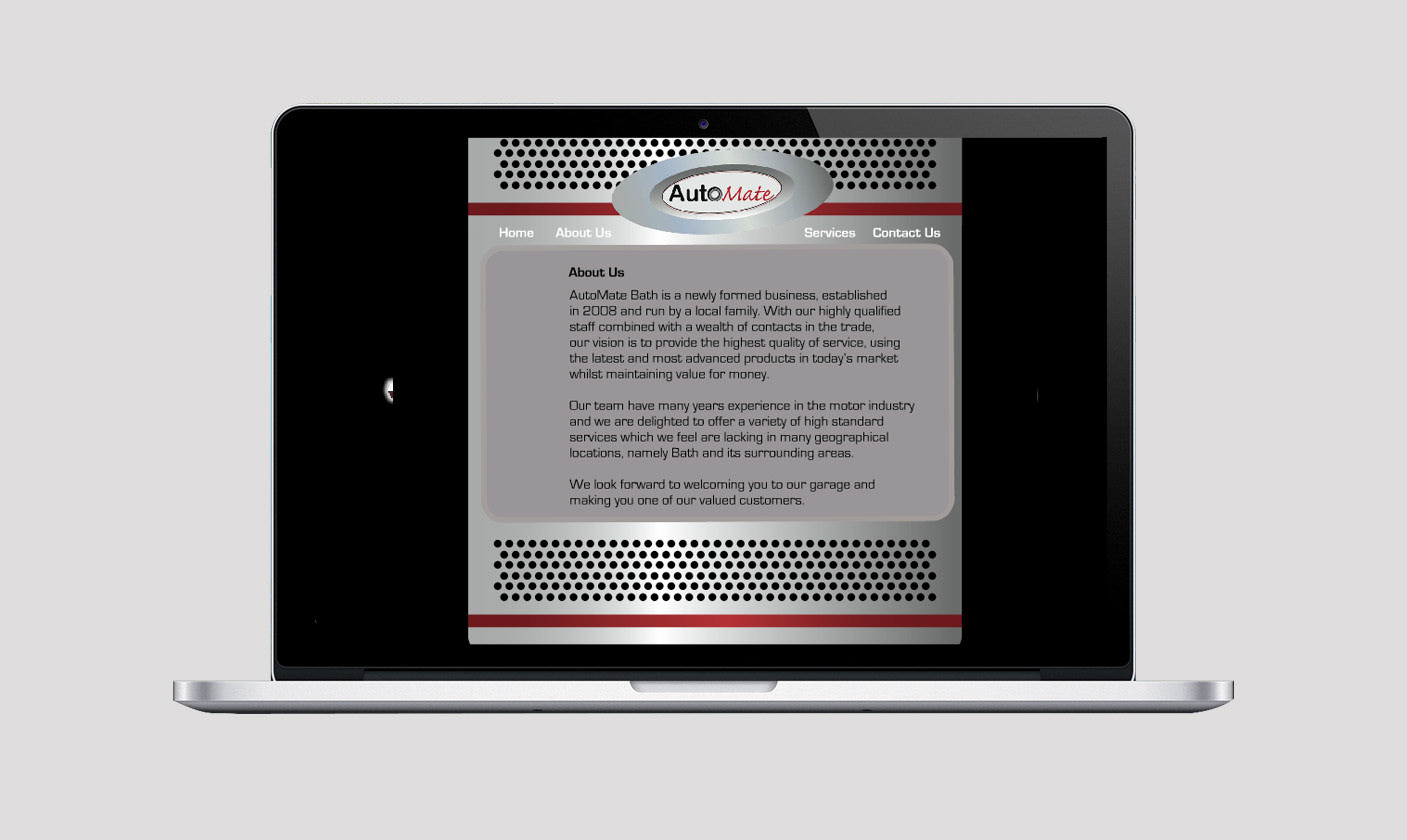
AutoMate: A Case Study in Boosting Awareness of a New Auto Repair Business
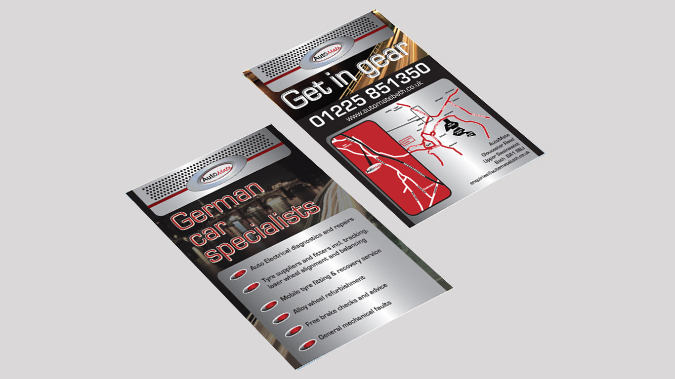
AutoMate, a new auto repair business, came to us seeking to raise awareness of their brand in the local community. Our brief was to develop a branding strategy that would get people talking about their business, with a focus on a custom business card design, an attention-grabbing flyer, and a visually stunning Flash website.
Our solution included art direction that helped convey the business's values and quality of service. We also created a tagline that spoke directly to potential customers: "Get in Gear." This tagline helped convey the message that AutoMate was the place to go for reliable and trustworthy auto repair services.
To create a visual identity for AutoMate, we carefully selected photos that showcased their expertise and attention to detail. We then put our artworking and graphic design skills to work, creating a custom business card design that would help the business stand out from competitors.
In addition to the business cards, we also designed an attention-grabbing flyer that highlighted the benefits of using AutoMate for auto repair needs. This flyer incorporated the same tagline as the business cards and was designed to attract attention and generate interest in the business.
Finally, we created a visually stunning Flash website that featured engaging graphics, animations, and interactive elements. The website showcased the business's services, expertise, and testimonials from satisfied customers. The website's design was optimized for search engines, making it easier for potential customers to find AutoMate online.
Overall, the work we did for AutoMate included art direction, copywriting, photography selection, artworking, and graphic design. By creating a strong visual identity and messaging that resonated with potential customers, AutoMate was able to increase awareness of their brand and generate interest in their services. The custom business card design, attention-grabbing flyer, and visually stunning Flash website all played a role in the success of this case study, and we look forward to seeing AutoMate continue to grow and succeed in the competitive auto repair industry.

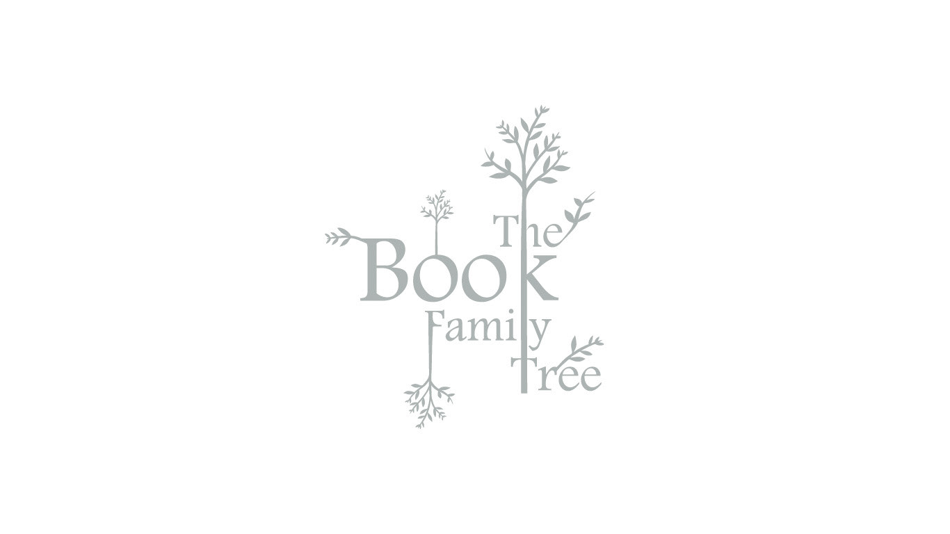
Case Study: The Book Family Tree
Background: Julie Book has gathered extensive information about her family history and wanted to showcase it on a website accessible to family members worldwide. The collection included family trees, names, dates, photos, letters, records, and memoirs.
Brief: To create an engaging and interesting website that communicates a sense of pride and honor for the family history.
Solution: A bespoke, animated Flash website featuring a book at the center of the design was created. The book symbolizes information and history, making it the perfect choice for the website. The family logo was designed to replace a coat of arms, and it incorporated branches of trees into the type.
Summary of work done: The project included the creation of a family logo and a bespoke website featuring animations, family trees, photos, letters, records, and memoirs to showcase the family history to family members worldwide.
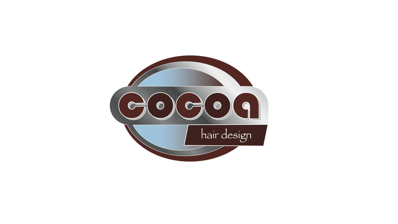
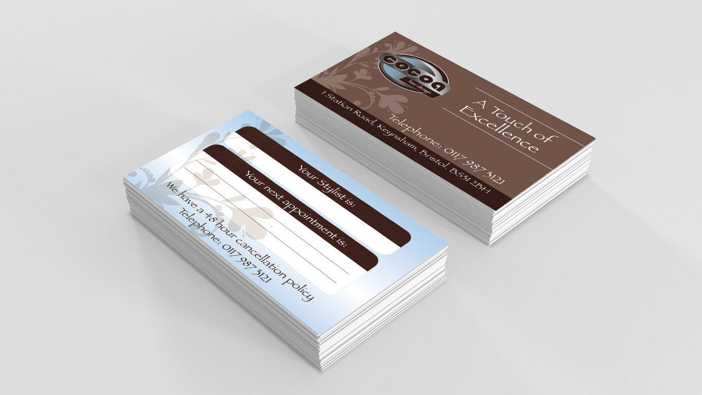
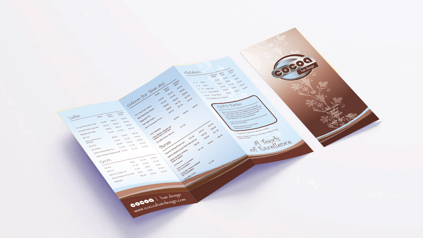
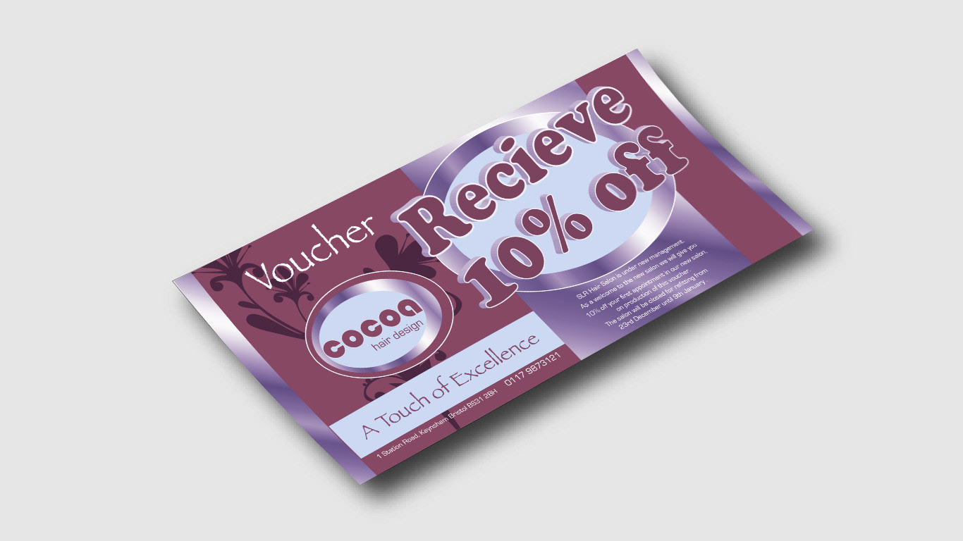
Case Study: Cocoa Hair Design
Background: The directors of Cocoa Hair Design had recently acquired a beauty salon in Keynsham, Bristol with a reputation for serving older clients. The new owners wanted to rebrand the salon to attract younger, contemporary clientele, while still building on its existing reputation.
Brief: Create a new image for Cocoa Hair Design that appeals to a younger, more fashionable audience. The name "Cocoa Hair Design" was chosen to pay homage to the nearby Cadbury chocolate factory.
Solution: The creation of a new logo that conveys the salon's fresh, modern aesthetic. Various marketing materials, such as promotional vouchers, business cards, and a printed price list, were designed to promote the new brand. An animated Flash website was also created to set the scene for online followers and convey sophistication and style.
Results: The rebranding effort was successful in attracting the desired younger, more fashion-conscious clientele. The salon's new website was promoted at a local cinema, leading to increased visibility and foot traffic.
Summary of work done: Branding (logo design), ideation, online animation, art direction, photography, graphic design (logo, promotional materials, business cards, price list), and artworking.

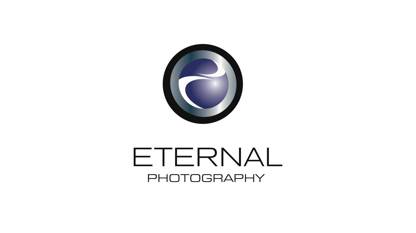
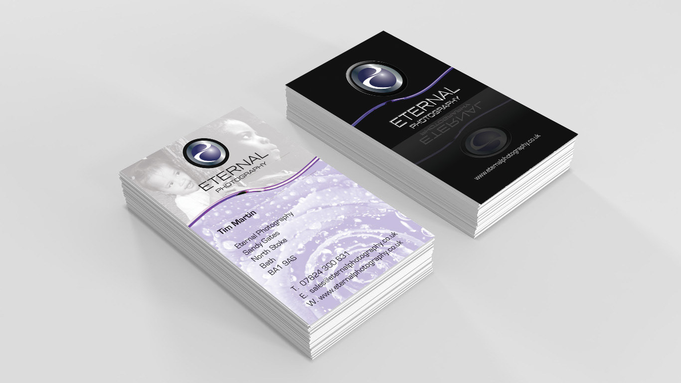
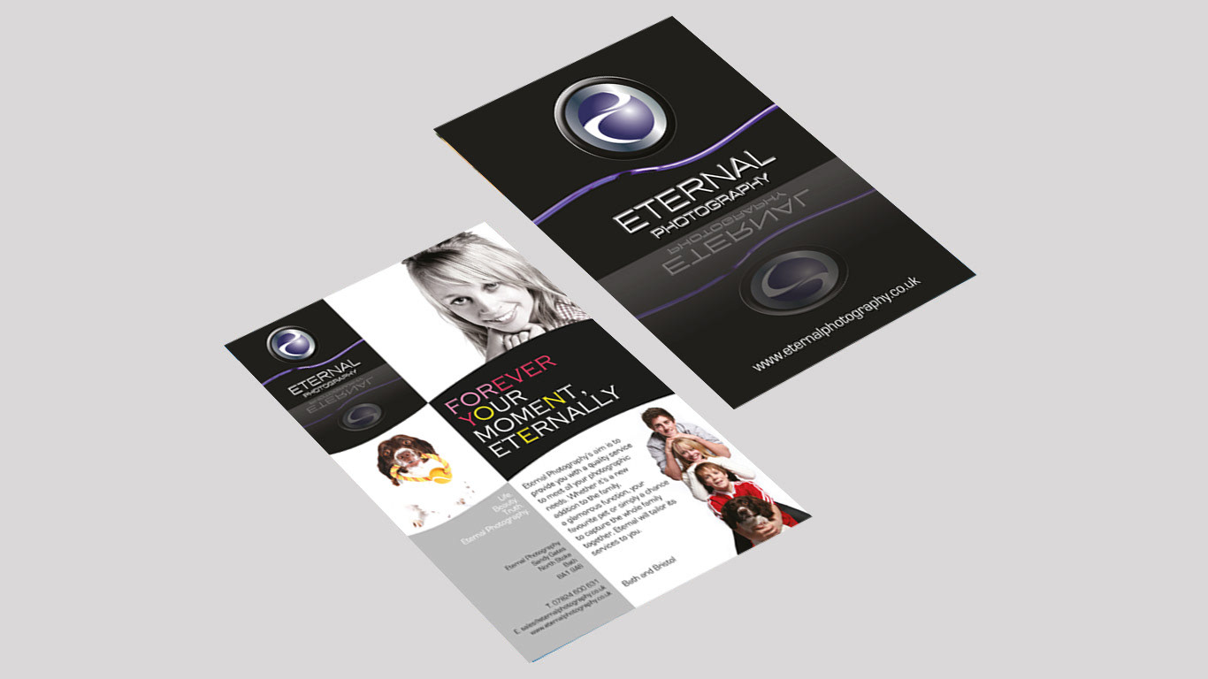
Case Study: Eternal Photography
Background: Mr Martin, an aspiring professional photographer, wanted to start his own photography business.
Brief: Mr Martin aimed to capture the sentiment of portrait photography and create a contemporary style inspired by the photographic franchise, Venture. He wanted to showcase his portfolio online.
Solution: The business was named "Eternal Photography," and a logo was created using a circle, a universal symbol of infinity, to convey the abstract notion of "eternal." A sans serif font was used to give a modern touch. A flash website was developed to display Martin's work in an elegant and stylish manner, with custom music to set the perfect tone. Business cards and flyers were created with effective copywriting to further enhance the brand.
Results: A stylish collection of printed material, conveying a contemporary and stylish identity that aligns with the brand's vision.
Summary of work done: Logo design, Art direction, Copywriting, Graphic design for a flash website, flyers, and business cards.
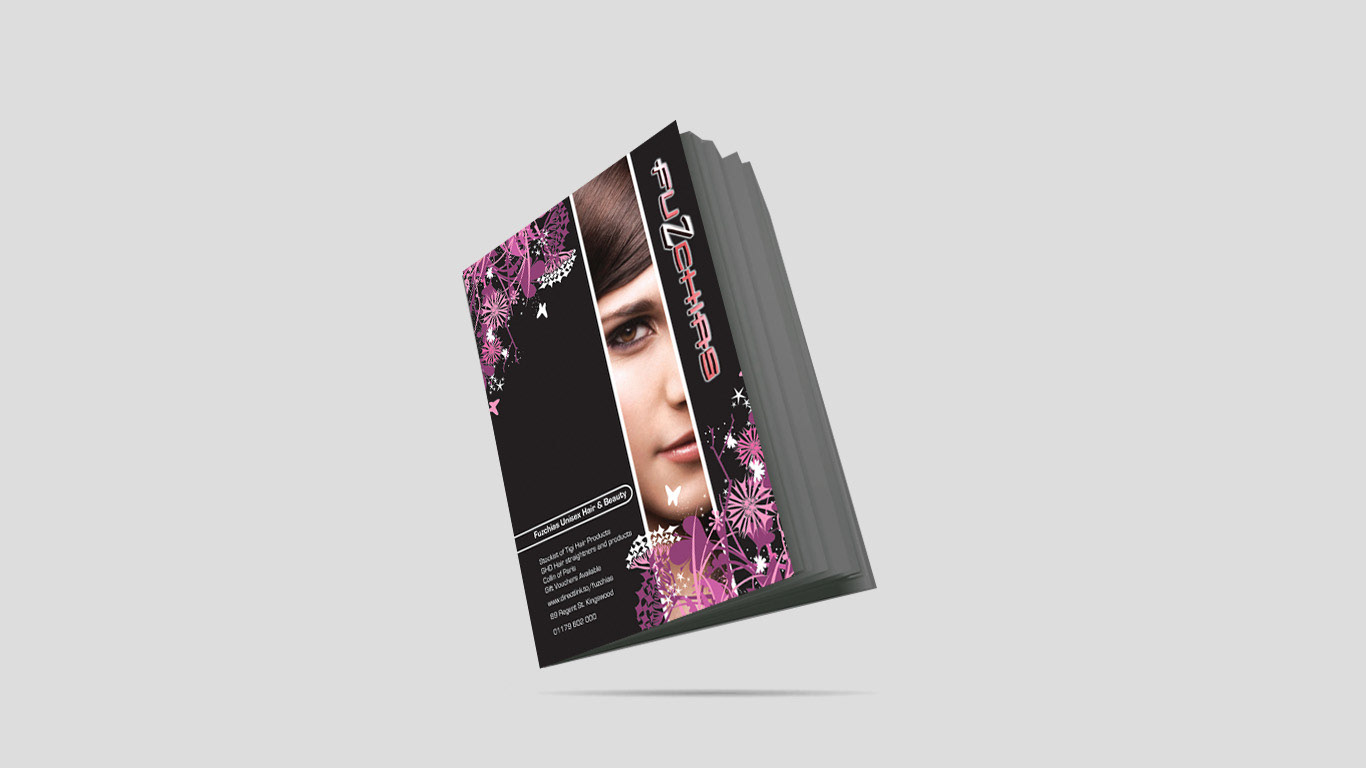
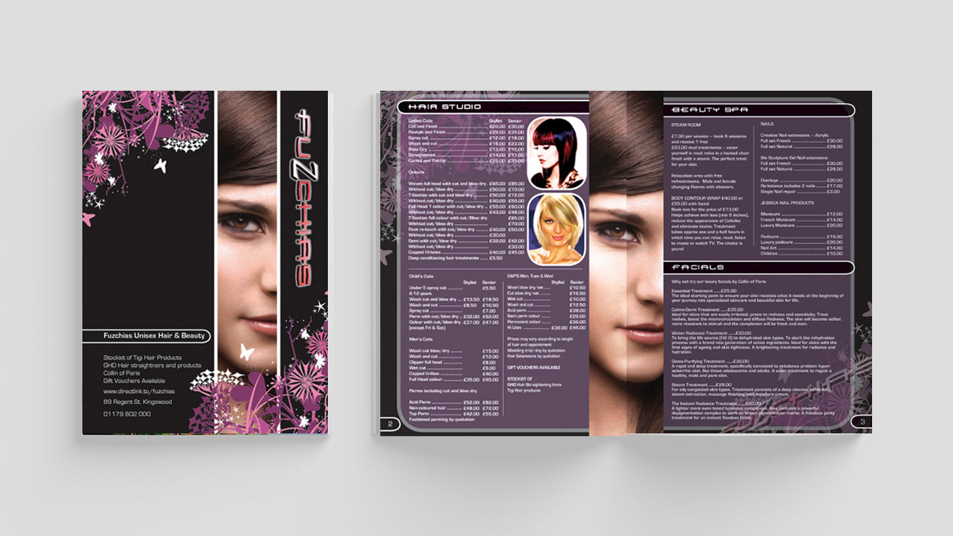
Case Study: Fuzchias
Brief: Fuzchias, a hair salon in Kingswood, Bristol, wanted to increase its online presence and create a stylish booklet that reflects its existing style.
Solution: Our team worked on the copywriting, art direction, photographic selection, and graphic design of an 8-page booklet that showcases the salon's services and atmosphere. We also designed a website with a flash intro that sets the tone for the salon's contemporary style and commitment to quality hair care.
Summary of work done:
Copywriting
Art direction
Photographic selection
Graphic design - 8 page booklet, website, Flash intro

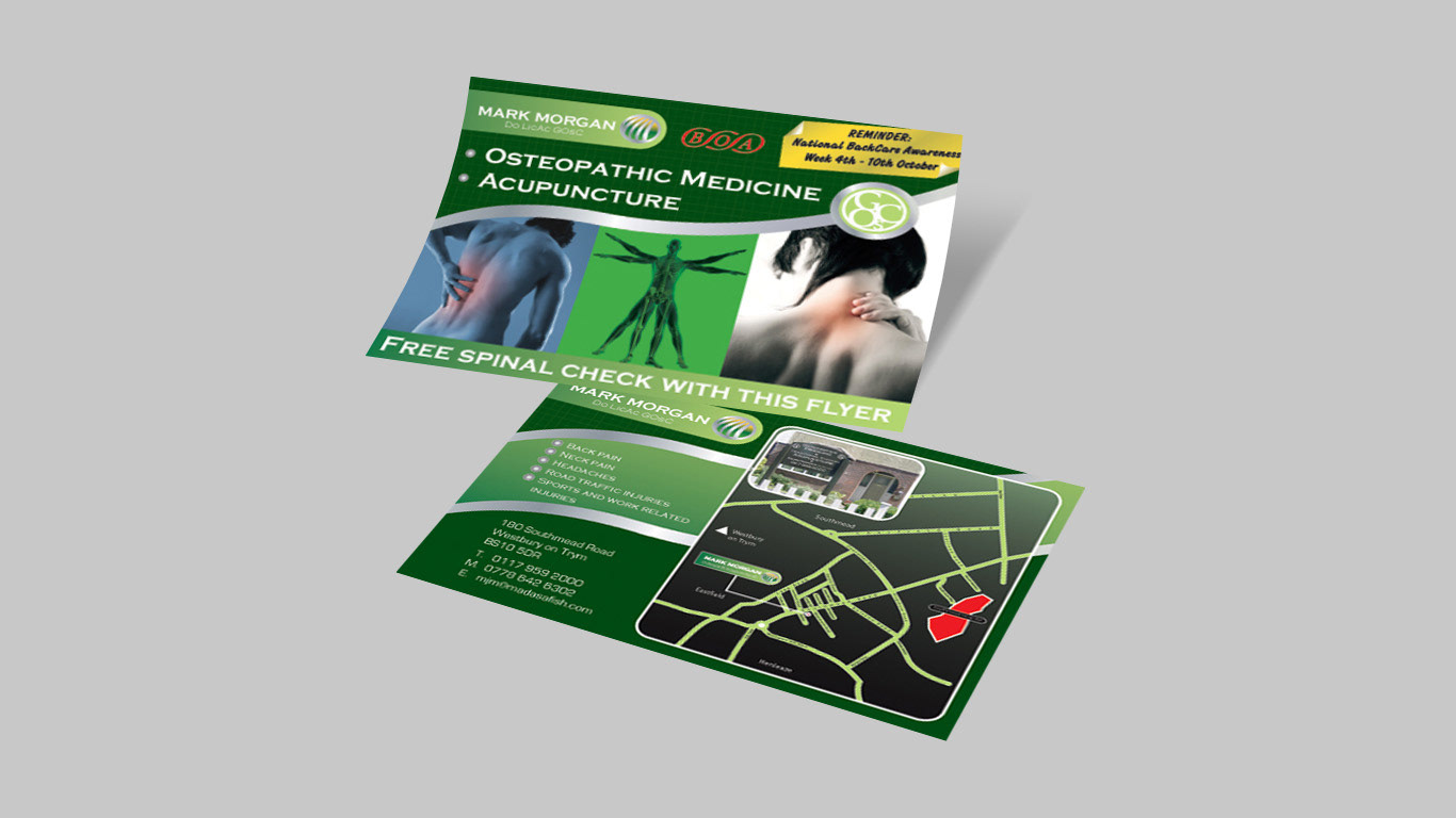
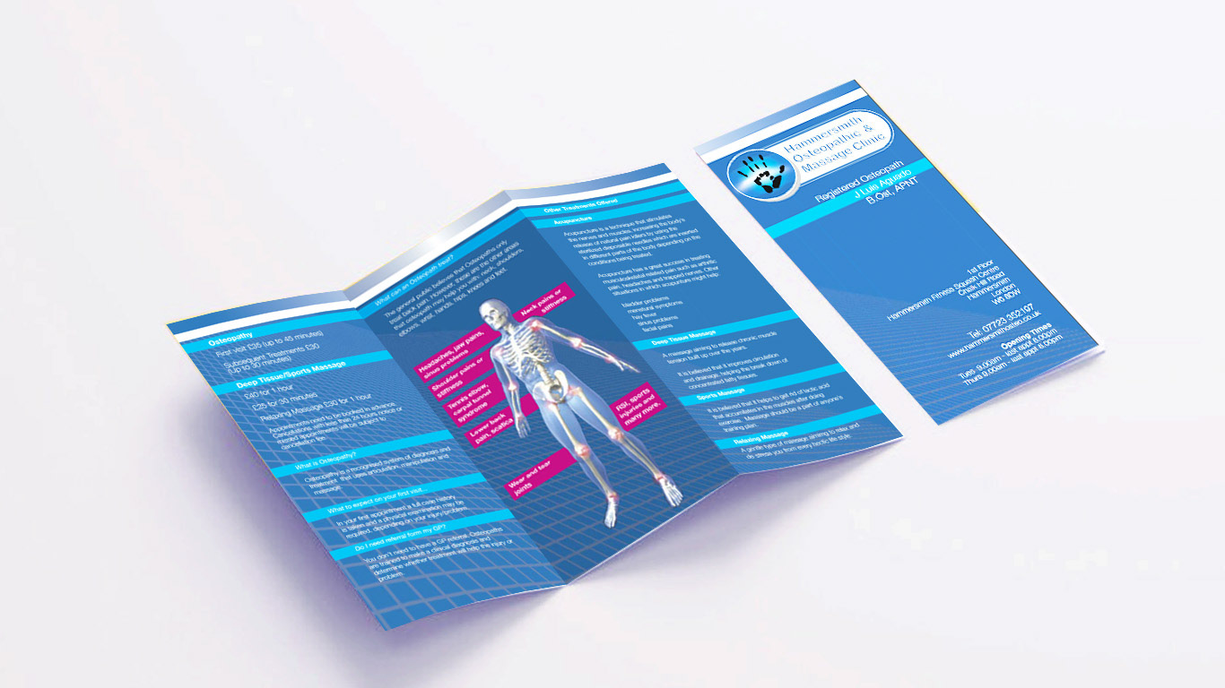
Case Study: Osteopath in Bristol
Mr Morgan is an established osteopath who operates from a 1920's semi-detached house in Westbury-on-Trym, Bristol. His clients mainly consist of office professionals and workers in the construction trade, referred to him by the local hospital. To increase his clientele, Mark wanted a leaflet design that communicated his services to his target audience while reflecting his industry and the professionalism he provided.
Our team created a corporate identity and designed a double-sided leaflet. The process involved meticulous image selection, graphical solutions, layout and colour scheme options. The resulting clinical piece of communication vividly displays a medical theme in an effective way. Additional touches to the design involved a 'post it' illustration displaying a message.
Our work involved logo and flyer design, and we take pride in delivering a solution that satisfied Mark's requirements and exceeded his expectations.
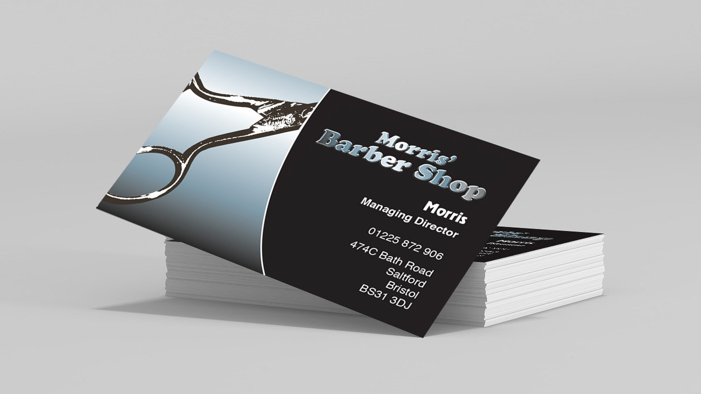
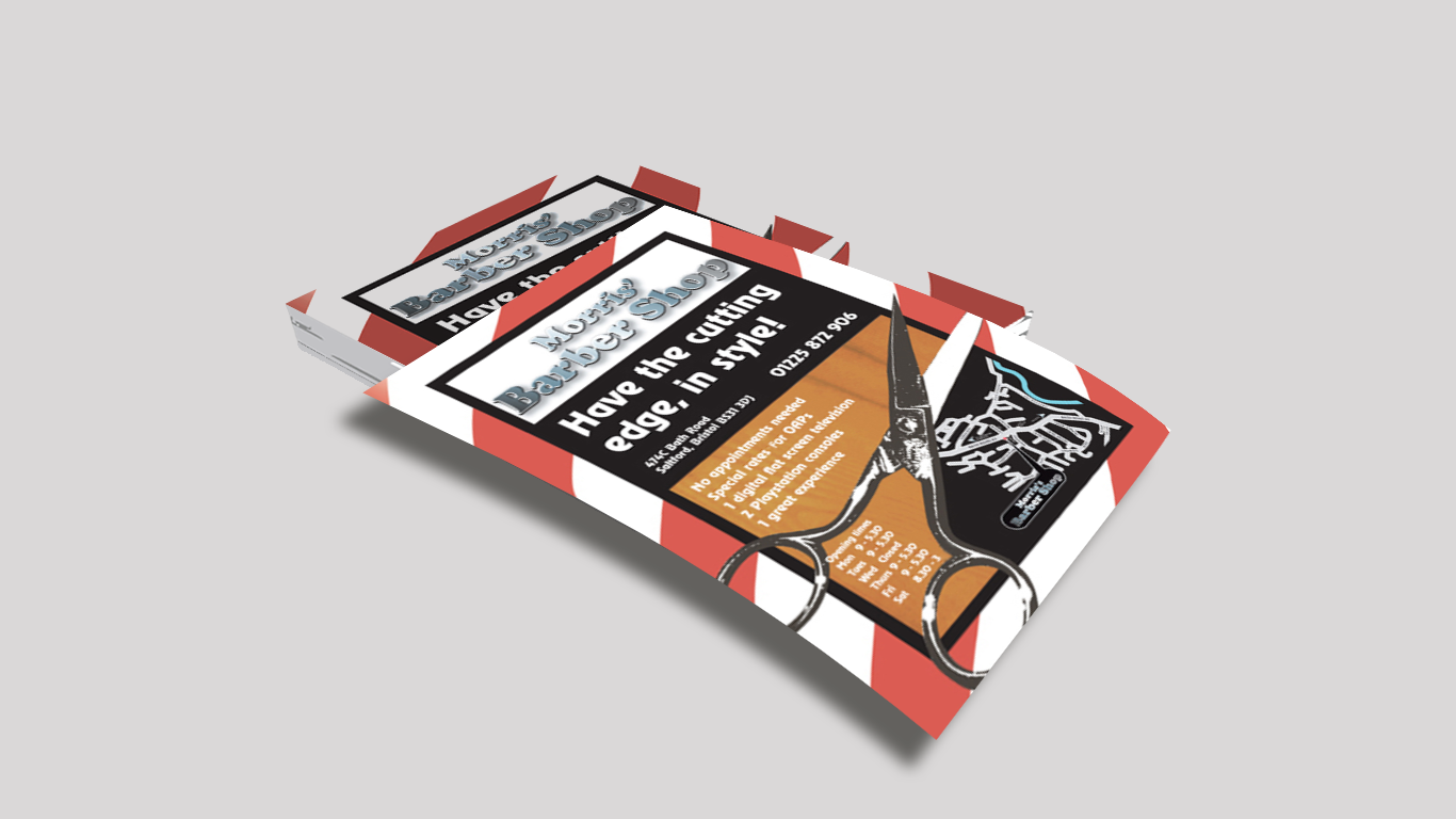
Case study: Morris’ Barber Shop
Brief: Increase awareness of Morris’ Barber Shop services and the stylish design of the premises. Highlight the high-tech facilities including a flat-screen TV and games console that entertain customers while being attended to.
Solution: Utilized visual design and copywriting to promote the shop's unique features and services, emphasizing the modern and comfortable atmosphere.
Result: A successful promotional campaign that raised awareness of Morris' Barber Shop among potential clients.
Summary of work done: Copywriting and graphic design that effectively conveyed Morris' Barber Shop services and atmosphere.
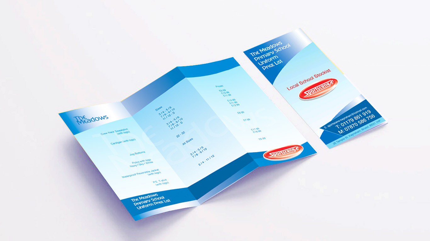
Case study: Sportscene
Sportscene is a small sports retail business in Keynsham, Bristol, generating income from selling sportswear, sports equipment, uniform supply and embroidery. Facing tough competition from new sports retail shops, Sportscene wanted to appeal to amateur sports enthusiasts and fashion-conscious youth brand consumers to increase sales of their sportswear and equipment.
To meet the brief, research was conducted to gather information about local competition and a distinctive, contemporary, sports-oriented identity was designed. The new identity elevated the business from a small uniform supply shop to a sports fashion retailer. A new school uniform price list featuring the new logo was designed to attract 11-16-year-olds who traditionally buy uniform to purchase branded fashion items at the store.
As a result of the new identity, Sportscene was successful in luring a growing clientele who once purchased uniform but are now at college or university. The change had strengthened the business, and the brand was now being connected to a reliable source of sports equipment.
The work done included research, image selection, illustration, branding (logo design), and graphic design of the price list.
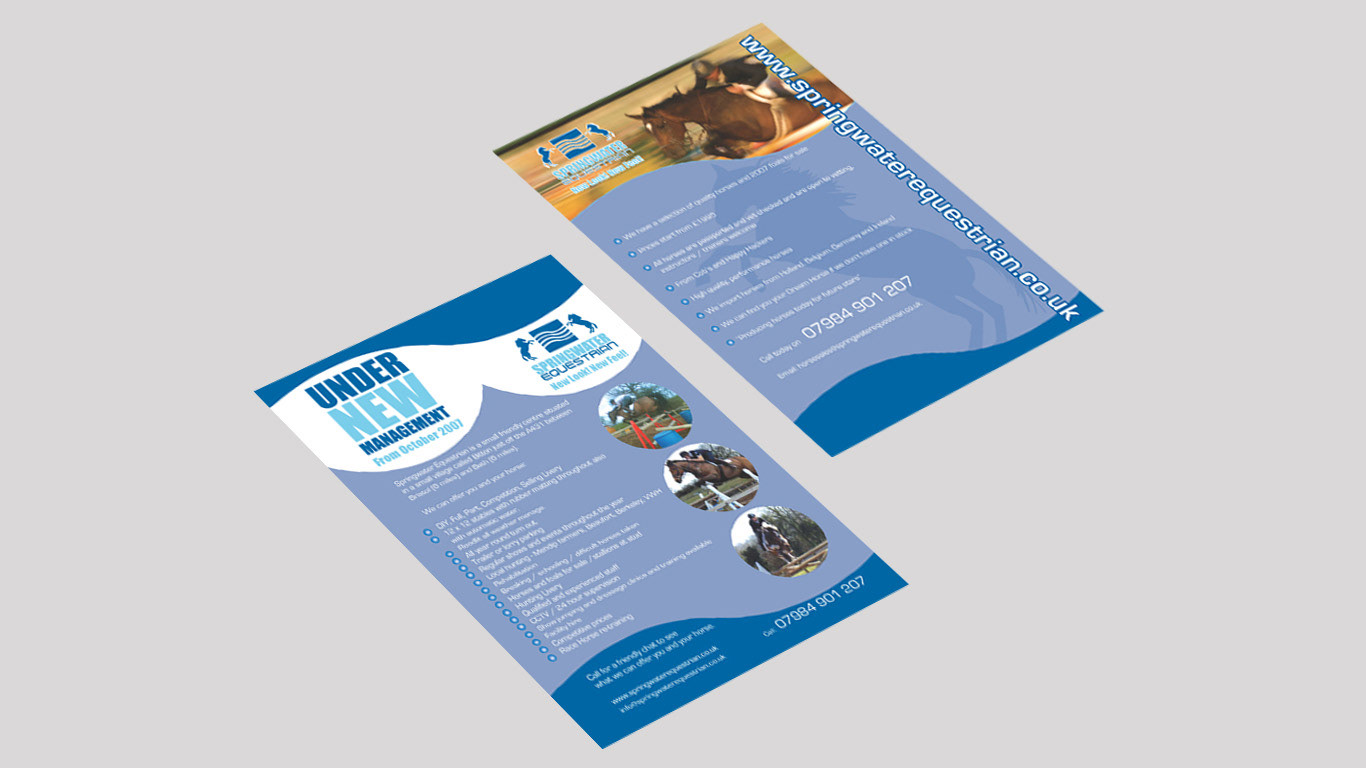
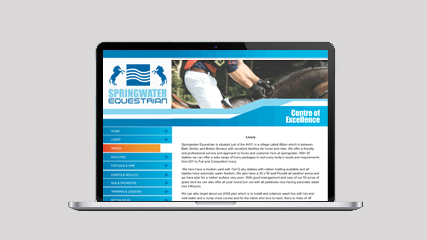
Case study: Springwater Equestrian
Background: Mr. Morley purchased a horse riding school in Bitton, a village located between Bath and Bristol.
Objective: Revitalize the Springwater brand and promote new services.
Solution: Design a new logo with a heraldry style to appeal to traditional horse riding groups, combined with a contemporary sans-serif font. Created signage, leaflets, and a new website to reflect the new branding.
Results: The changes breathed new life into the business.
Summary of work:
Logo design and branding, photo selection, graphic design for website, flyers, and signage.